CLIENT
The Sculpt edition
Balancing refinement with strength, The Sculpt Edition embodies the art of transformation through Pilates.
The Sculpt Edition, a premium Pilates studio, approached me to create a brand identity that would set it apart in a crowded wellness market. With a vision to attract a discerning, high-end clientele, the founder wanted a brand that not only reflected physical strength and form but also exuded refinement, elegance, and a sense of understated luxury. The challenge was to strike the perfect balance—sophisticated enough to resonate with a wealthy audience, yet minimal and modern to mirror the precision and fluidity at the heart of Pilates.


VISUAL IDENTITY
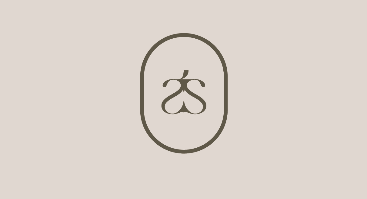
The visual identity for The Sculpt Edition was designed to embody refinement, precision, and the transformative nature of Pilates, striking a delicate balance between simplicity and sophistication. The logo centres on thin, elegant letterforms with subtle curvature, alluding to the idea of ‘sculpting’—a reflection of both the physical transformation Pilates offers and the studio’s meticulous, refined approach. To elevate this further, a bespoke brandmark was created by merging the ‘S’ with a stylised ‘t’, forming a sculptural emblem that is fluid yet structured. The curved lines convey movement and grace, while the anchored ‘t’ grounds the form, creating a distinctive symbol that is both modern and memorable. This emblem serves as a strong visual metaphor for Pilates—balance, strength, and flow—and offers a mark of recognisability that can stand independently across applications, from studio signage to digital platforms. Together, these elements establish a brand identity that feels premium, contemporary, and deeply aligned with the ethos of The Sculpt Edition.


“Francesca is a total professional and true talent. Right from the start, she really listened to what was important to me. This was reflected in her openness and communication throughout the whole process. She got my vision for the brand and has created the most beautiful aesthetic. I am beyond grateful for her commitment to providing the best service.”
BECKI ORR, FOUNDER OF THE SCULPT EDITION

