


Haseya
CLIENT
Haseya is a soulful brand born from resilience, rising to embody healing, presence, and strength.
Simone – the founder of Haseya – a yoga teacher, retreat facilitator, and mentor whose story is as powerful as the brand she’s built. Haseya means “to rise up.” It’s a call to come together – across cultures, across pain, across past versions of ourselves – and move toward healing. That message isn’t just poetic. It’s personal. Simone turned to yoga during one of the hardest chapters of her life, and what began as a practice to survive has grown into a business, a lifestyle, and a movement that’s helping others rise too.


VISUAL IDENTITY
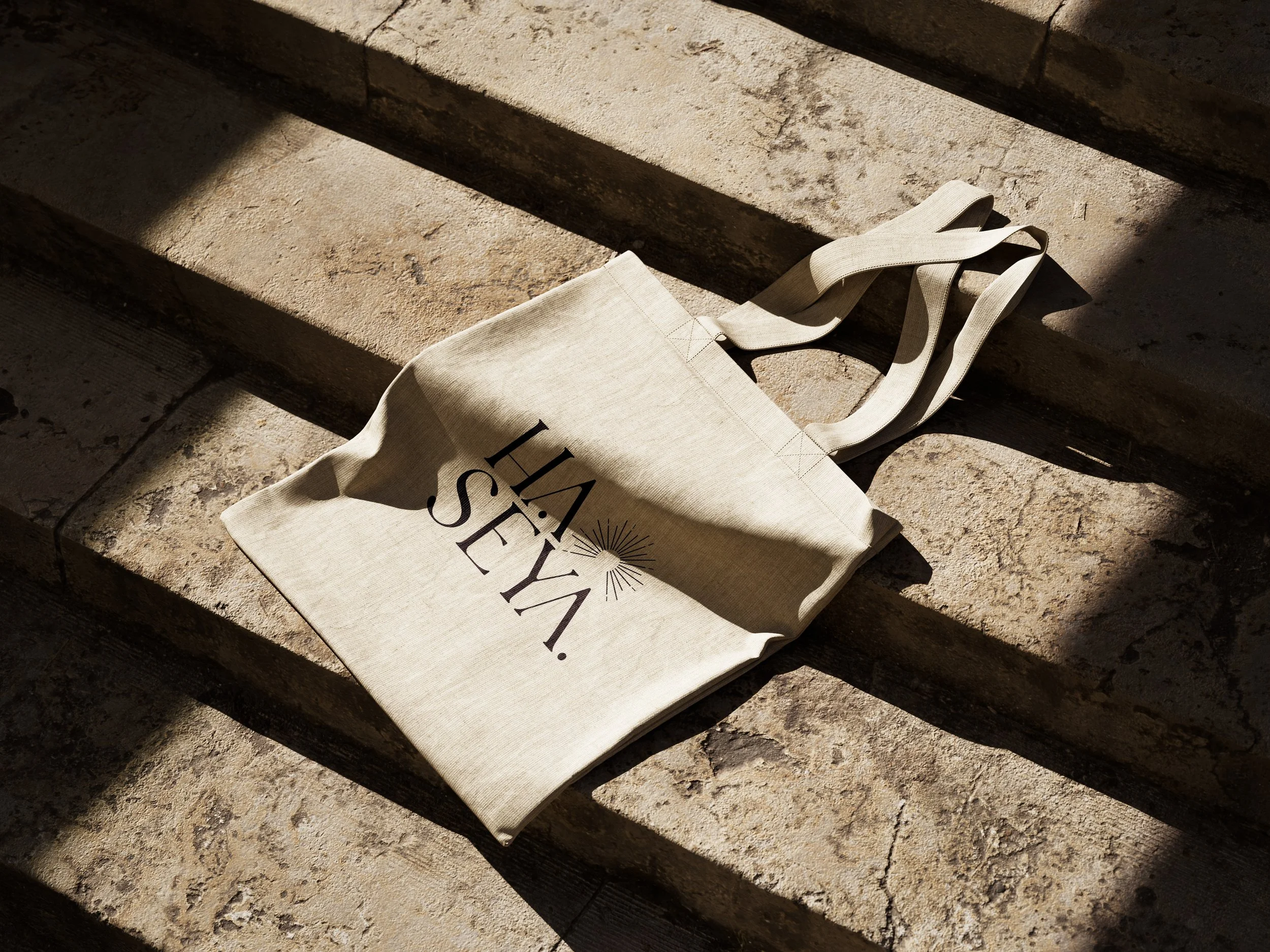
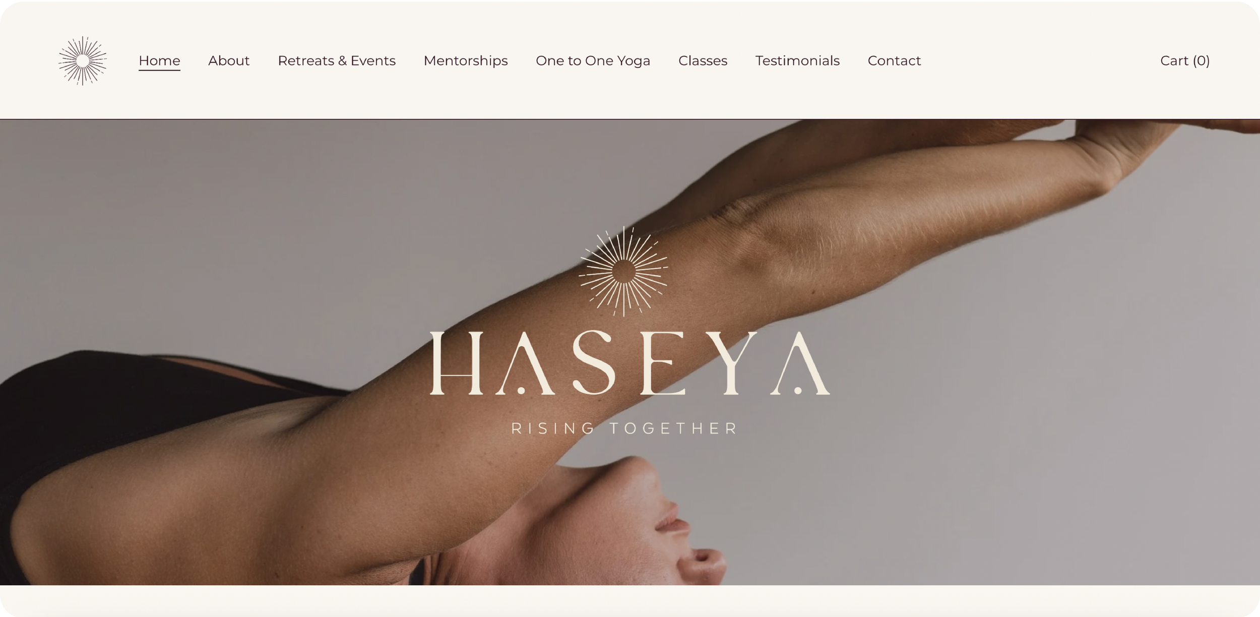
This brand is rooted in meaning. Every decision—from the colour palette to the typography to the symbol at its core—was designed to hold space for that journey: a brand that feels like breath, presence, and strength. Drawing inspiration from Simone’s African heritage, the colour palette grounds the identity in warm, earthy tones that reflect both her roots and the deeper significance of the name Haseya, which speaks to grounding and connection with the earth. These hues not only honour her story but also embody the retreat’s ethos: a space of balance, rootedness, and renewal. At the centre of the identity sits a logo that embraces simplicity and fluid forms, designed to capture the sensual, immersive experience of yoga. Subtly referencing a rising sun, it becomes a symbol of awakening, energy, and new beginnings—perfectly aligned with the restorative and transformative spirit of the retreat.

“Working with Frankie has been one of the most easeful and aligned creative collaborations I’ve experienced. She held such clear space for my vision to come through, while gently guiding the process with so much care, patience and skill. I felt heard, supported and understood every step of the way. I can’t recommend her enough.”
SIMONE CASSELLS, FOUNDER OF HASEYA


DIGITAL EXPERIENCE
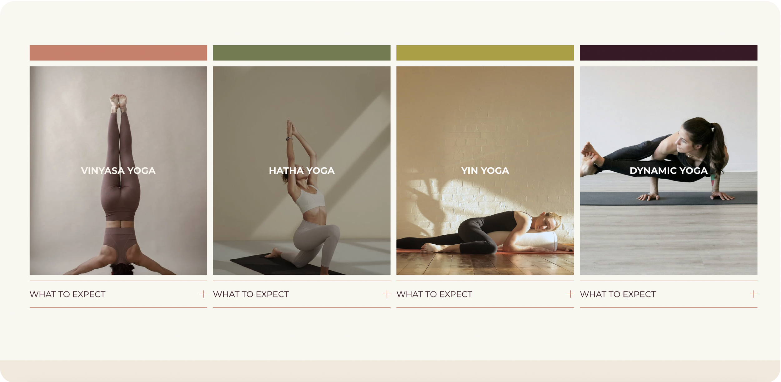
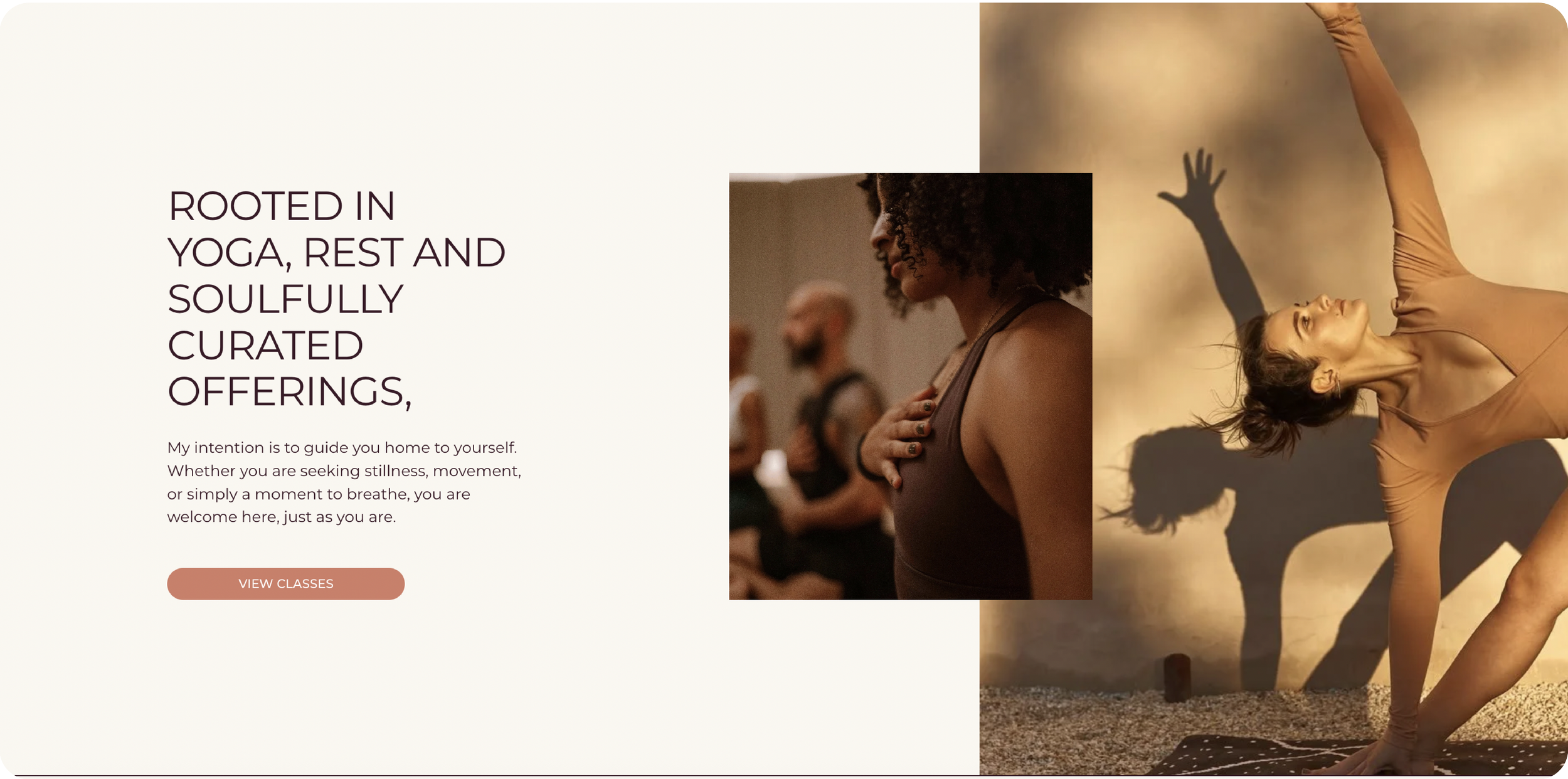
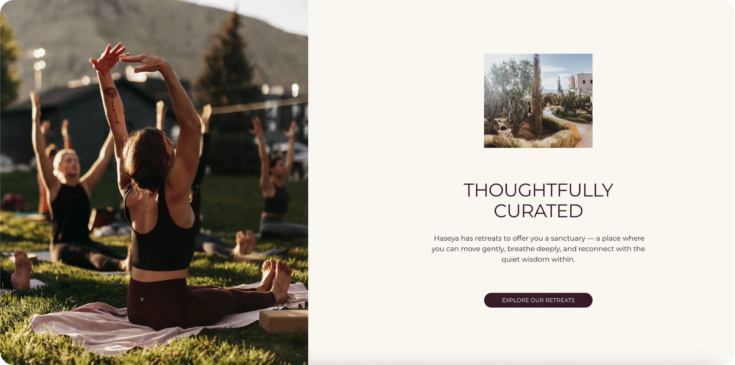
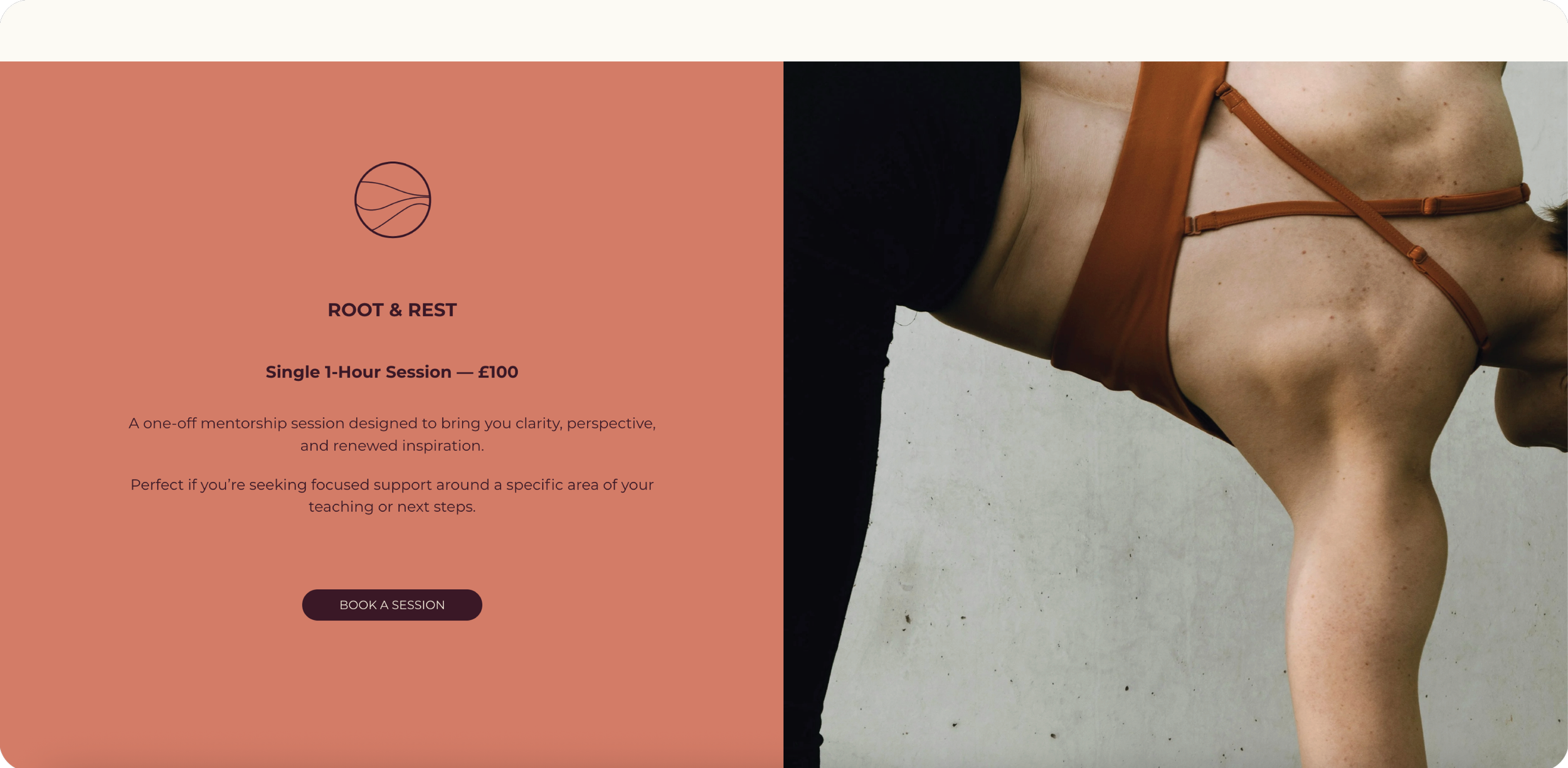
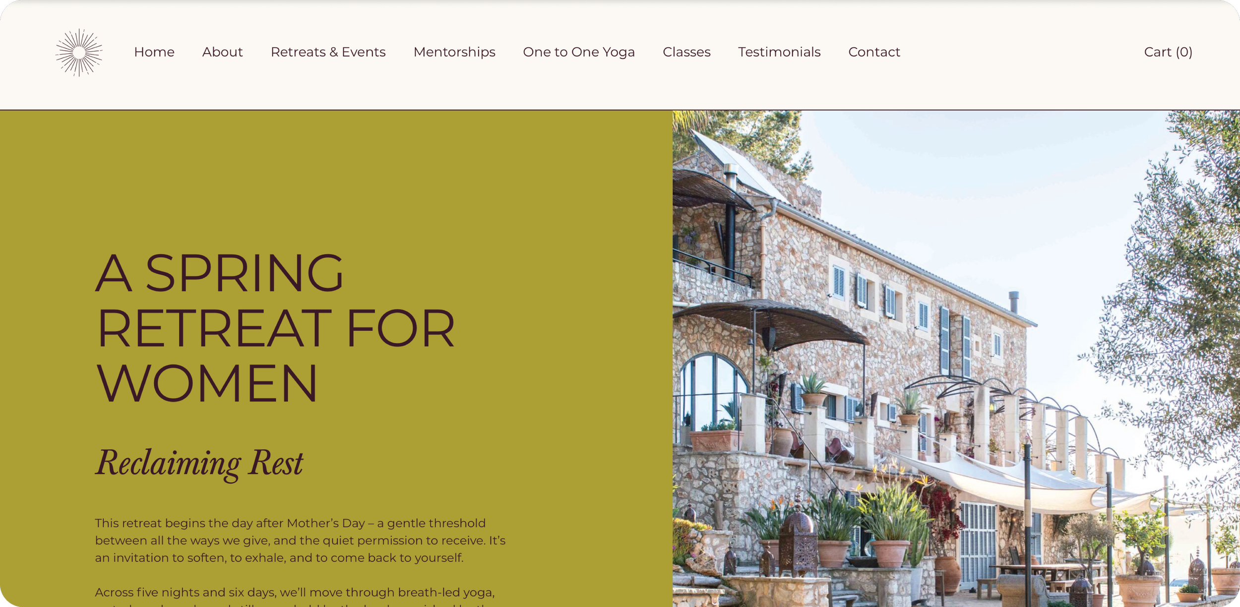
For the Haseya brand, I designed a digital experience that is guided by colour as much as by content. Rather than following the typical yoga aesthetic of minimal neutrals, we intentionally chose colours that feel rich, soulful, and restorative. Each hue was selected to evoke a sense of calm and renewal while also reflecting the vibrancy of Simone’s cultural roots. This colour journey doesn’t just decorate the brand—it shapes how visitors experience it.
On the website, the tones guide users through their journey, subtly signalling moments of pause, reflection, and action. On social media, the palette creates cohesion across visuals, reinforcing the retreat’s ethos: a grounded yet transformative space where people come to restore, connect, and rise.
By grounding the brand in this palette, we’ve created a digital experience that feels both authentic and distinctive—one that resonates emotionally with clients and sets Haseya apart from the sea of neutral-toned wellness brands.


